
Potly
Project Type: Product Design, Motion, UI, Branding
Client: Academic
Caring for plants is often inconsistent, especially for casual or inexperienced owners. Plants can’t express what they need, which leads to guesswork, overwatering, neglect, and often, dying plants. Many people want to fill their homes with real greenery, but busy schedules make consistent care difficult to maintain. This creates a gap between the desire to own plants and the ability to care for them properly.
Potly was developed as a product design case study to explore that gap by focusing on how clearer communication could make plant care easier and more intuitive.
Interface
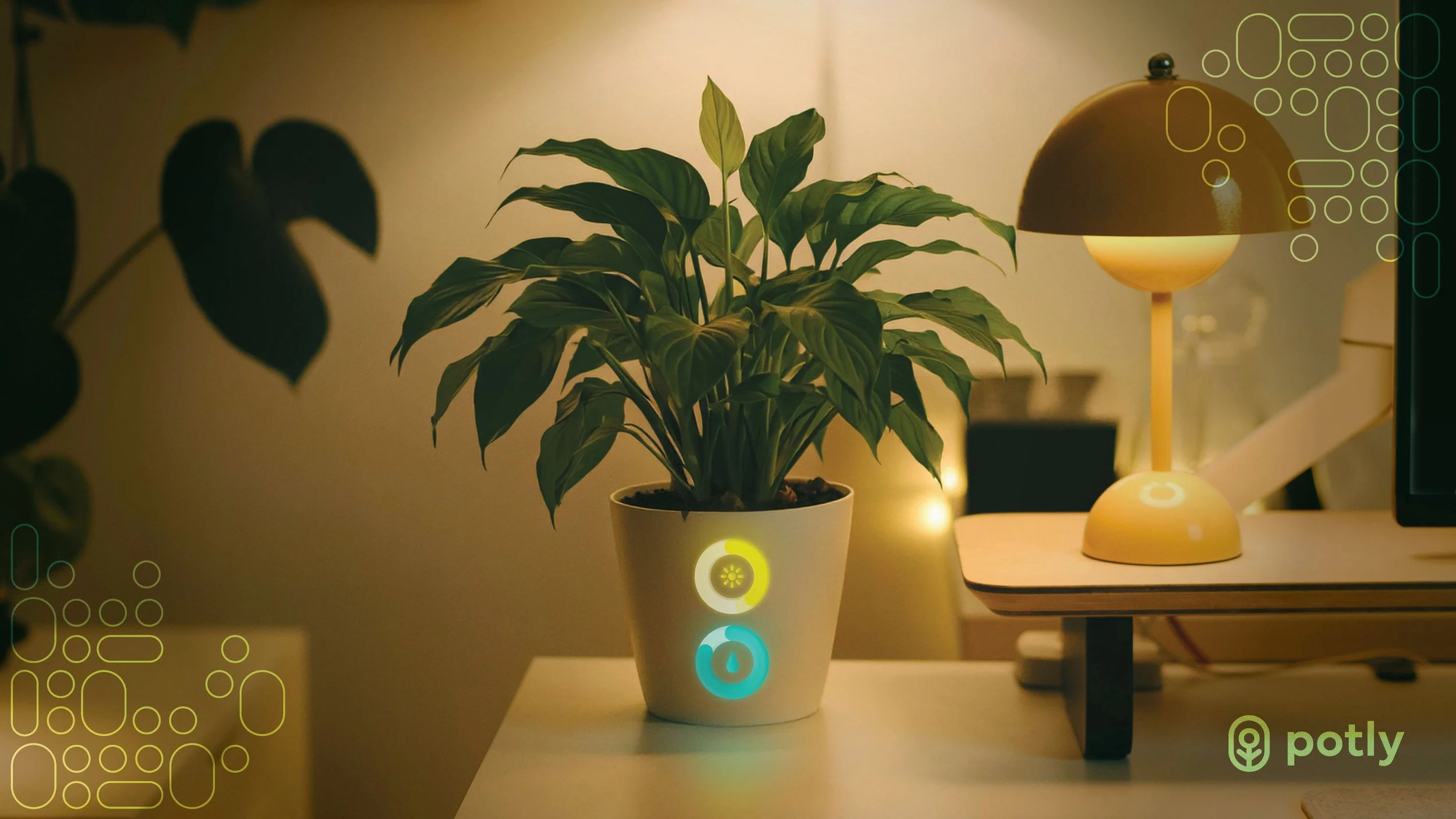
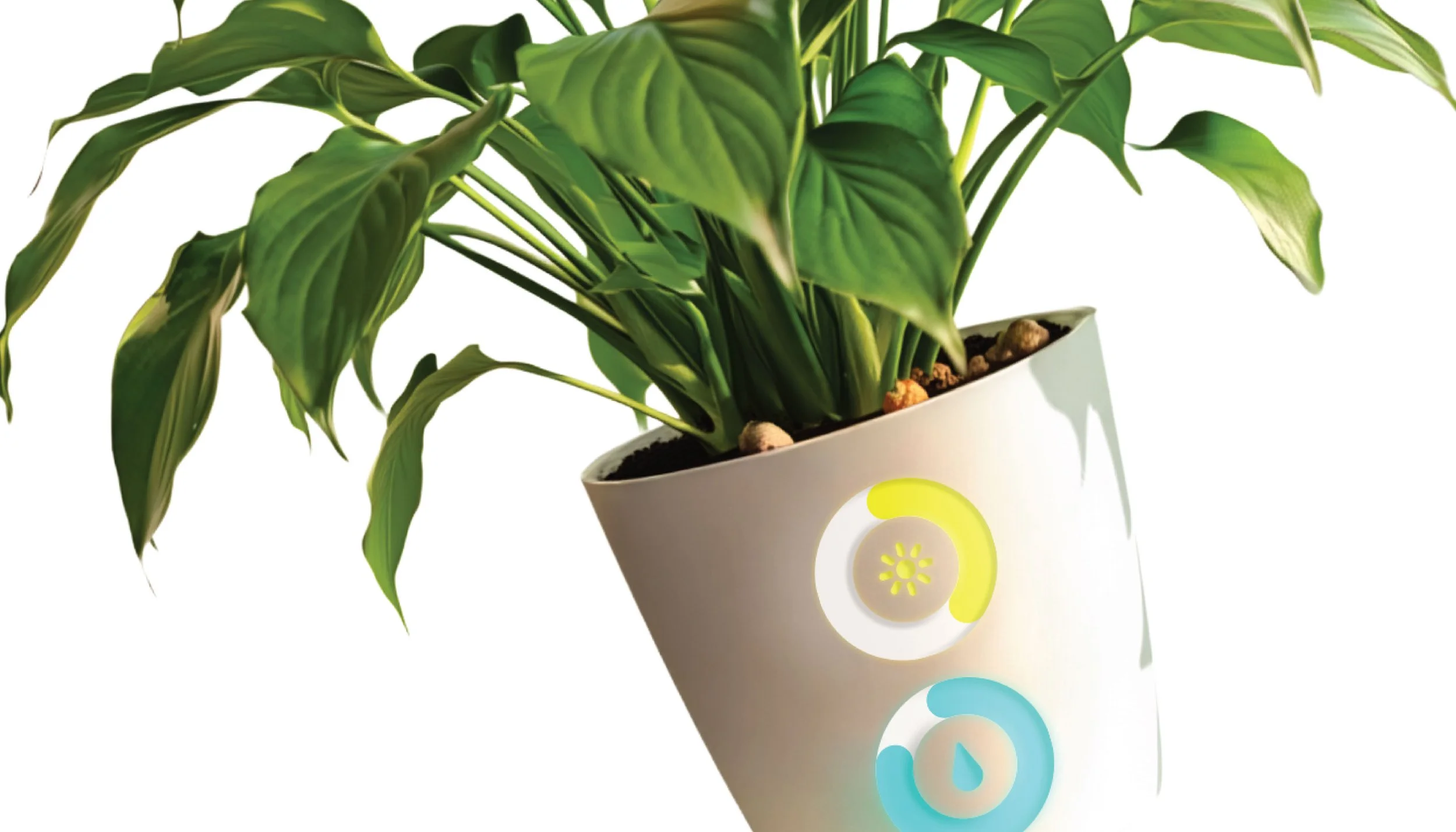
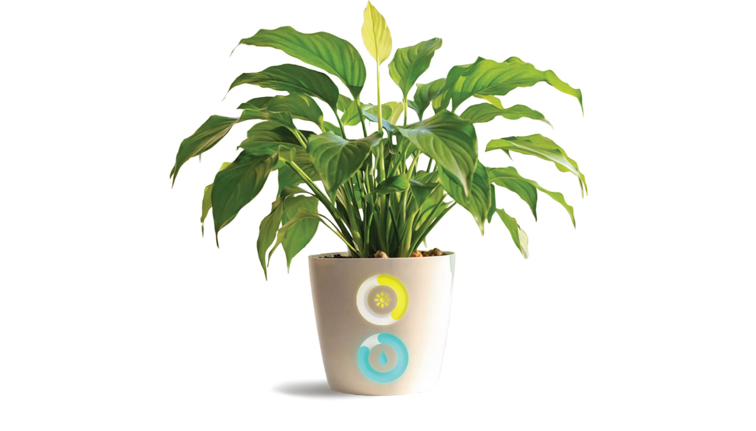
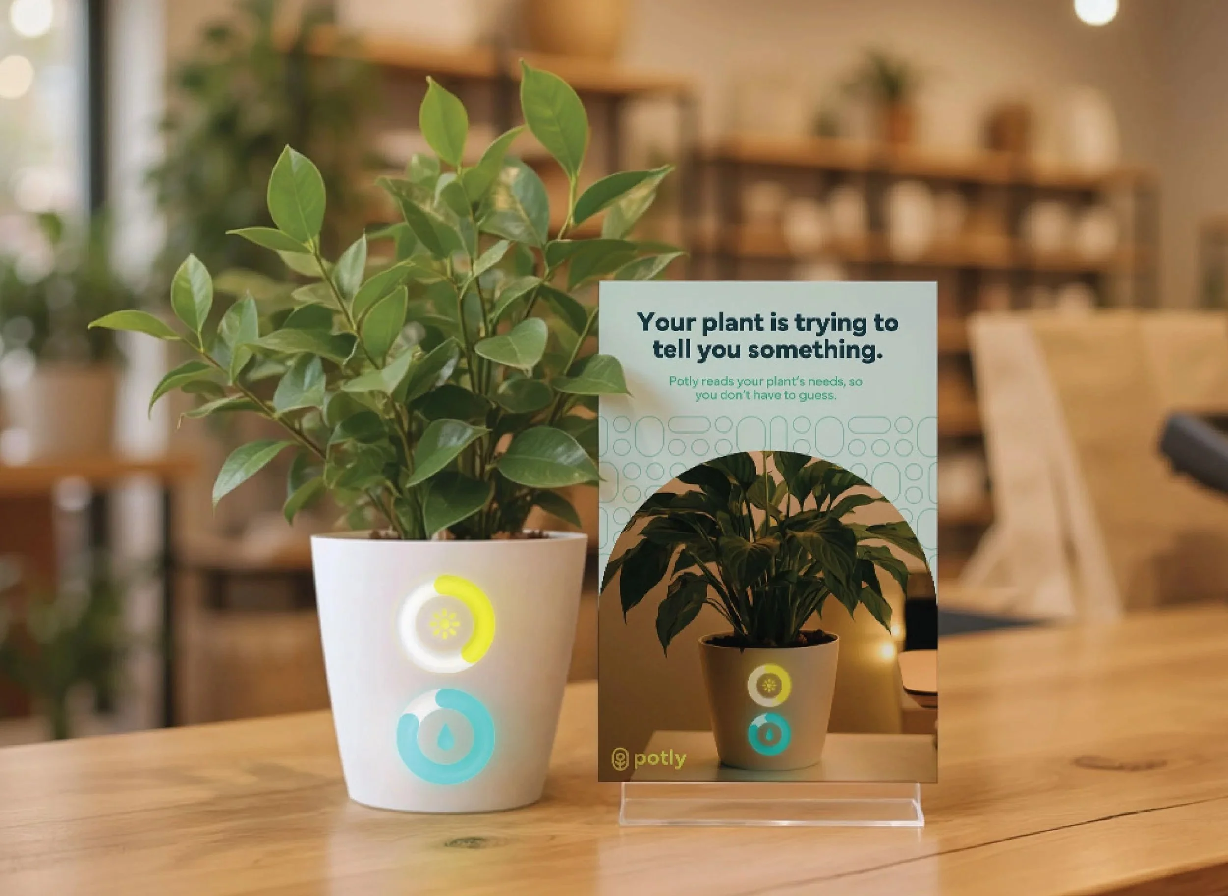
The interface of the pot is intentionally simple and easy to understand at a glance. Rings were chosen as the primary visual system because they feel organic and fluid, reinforcing the natural qualities of the plant itself. At the same time, they function effectively as a data visualization tool, displaying levels such as water and sunlight through a continuous, readable form. This allows users to understand the plant’s needs instantly, without relying on text or instruction.
The circular form also subtly reflects the cyclical nature of life, reinforcing the relationship between the user and the plant over time.
Motion + Behavior
The interface responds in real time as the plant’s condition changes. Rather than moving continuously, the rings update gradually as moisture decreases or sunlight shifts, keeping the system grounded in the plant’s actual needs. Movement is slow and fluid, designed to feel calm and quiet. While the motion piece presents a time-lapsed version for clarity, the real experience is much more subtle, allowing the interface to exist as an ambient presence in the home.
Each ring functions as a continuous progress indicator, filling and lowering to reflect the levels of water and sunlight. When attention is needed, the rings shift to warmer tones and begin a slow blinking pattern, introducing urgency without overwhelming the user. Earlier explorations included more complex animations, but simplifying the system to a single responsive ring per metric improved clarity and made the interface easier to understand at a glance.
Brand
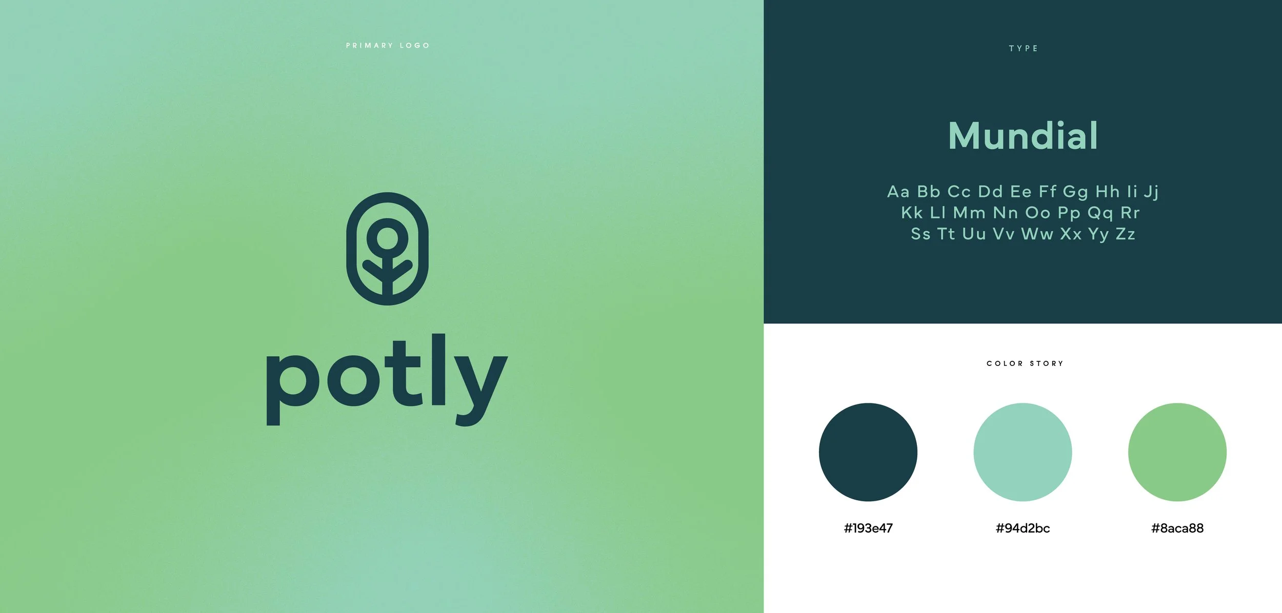
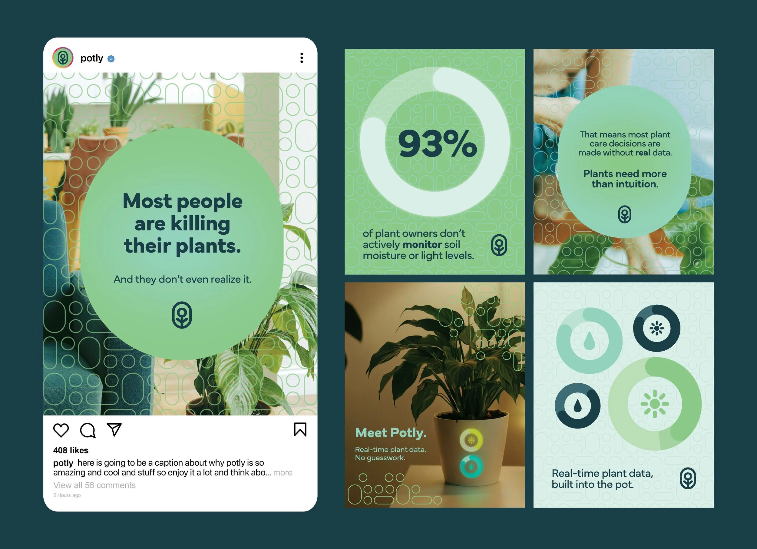
A brand system was developed from the interface, carrying the rounded shapes and ring forms into a consistent visual language. Natural greens and direct messaging help reinforce Potly’s goal of making plant care easier to understand, creating a connected experience across product and brand.